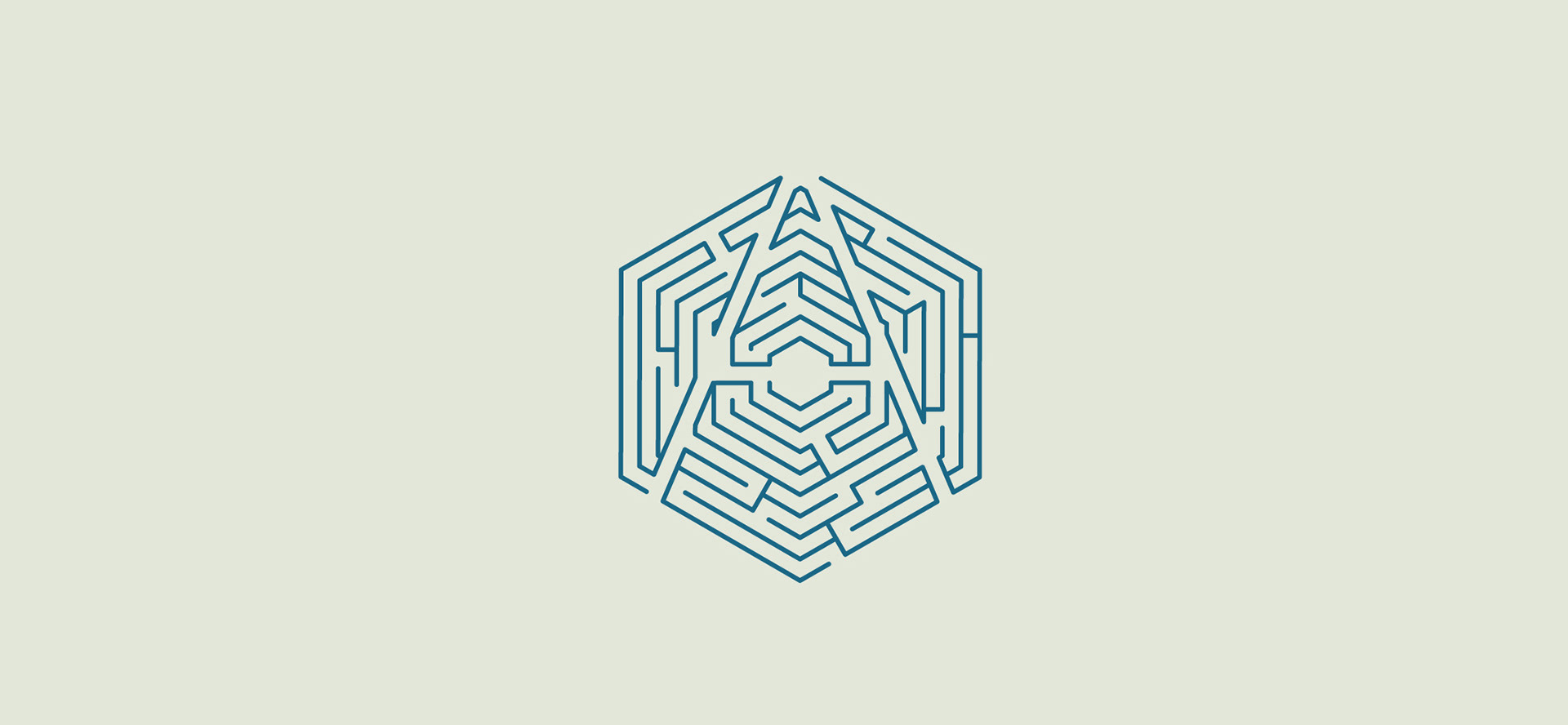
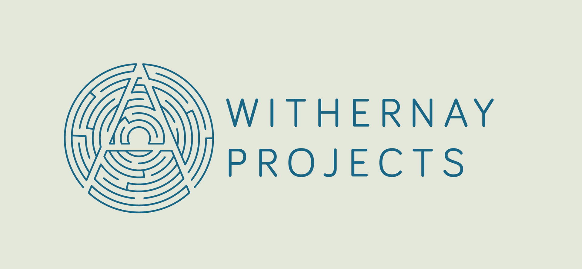
Buildings can sometimes be as inaccessable as labyrinths for people with disabilities. As an Access and Inclusive Design Consultancy specialised in Heritage buildings, Withernay Projects needed a branding which would reflect it's ability to solve architectural accessability issues.
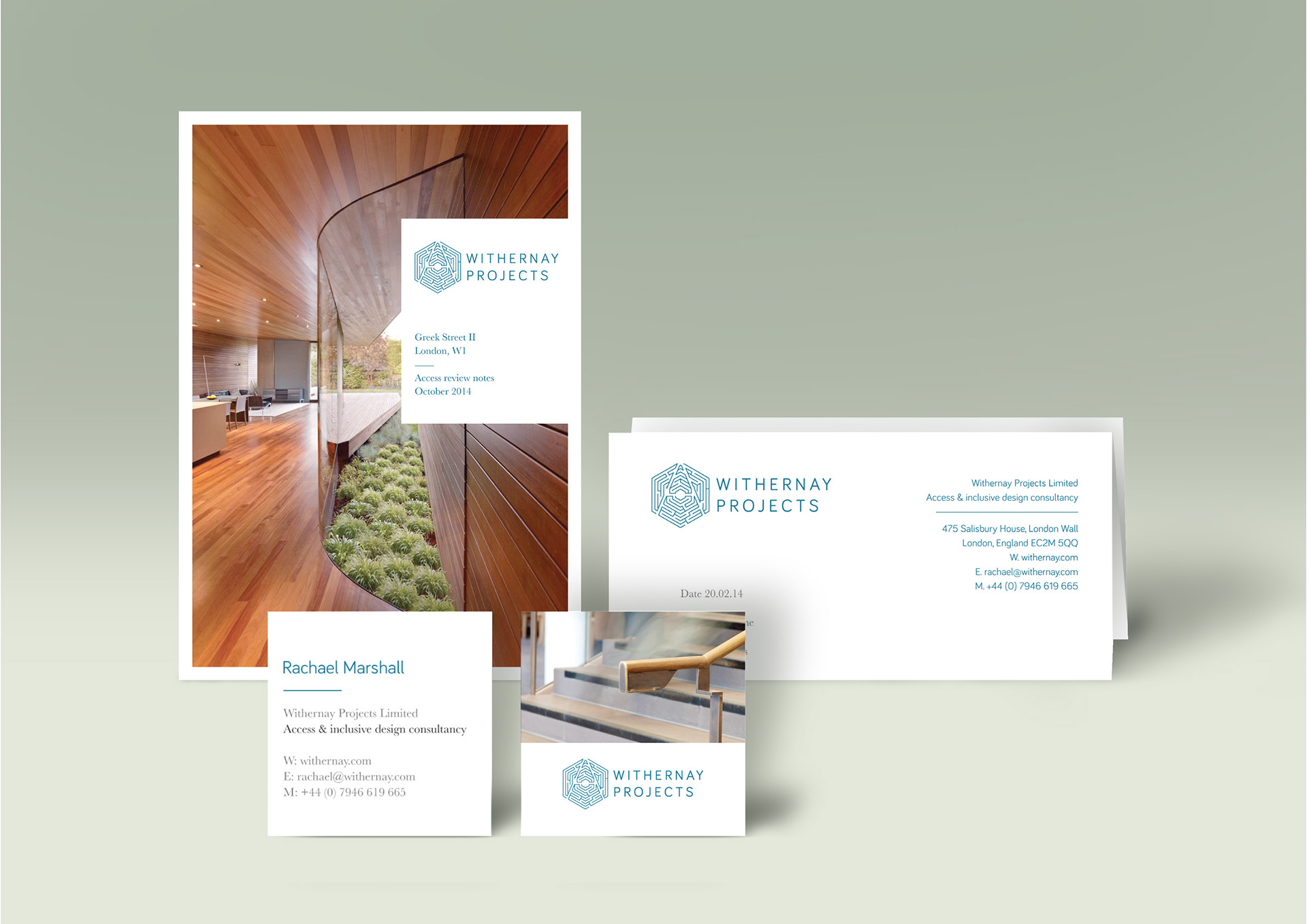
Branded stationery
The name Withernay (with an a') was what the owner Rachael was referred to by her friends to distinquish her from other Rachels.
The extra 'a' in Rachael's name also stands for access, hence the A which clears a path in a labyrinth. The logo needed to communicate the classical elegance of heritage while conveying a contemporay feel.
As well as a consultant, Rachael is also an architecture photographer so a brand family was created to represent both services.
Access & Inclusive Design Consultancy branding
Photography department branding